Wednesday, July 27, 2011
Using mastercharts for day trading
We shall now discuss how to use the Mastercharts for:
a) Day Trading: Multiple trades targeting less than 10-50 pips at a time. Such trades should not be carried overnight, unless it is at BPE
b) Short term trading: Trades targeting 50-100 pips that could run for more than a day
c) Medium Term Trading: Trades targeting 100-200 pips that could run for 1-2 weeks
d) Long Term trading: Trades that could run upward to four weeks or more (1,500 pips and above)
Day Trading:
For day trading you need to take the following steps:
a) Draw additional horizontal lines every 50 or 25 pips on your chart
b) Use the H4 time frames to pick your trading opportunities
c) Your buy signal is given when the RSI on H4 timeframe enters the Red box and the sell signal when it enters the Yellow box
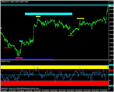
d) To enter a trade, go to M15 time frame and buy when both RSI on H4 and M15 enter the Red box and the sell signal when H4 and M15 enters the Yellow box
e) RSI 50 point level is where to take your profit or lock your trade (10-50 pips) per trade is adequate for this strategy.
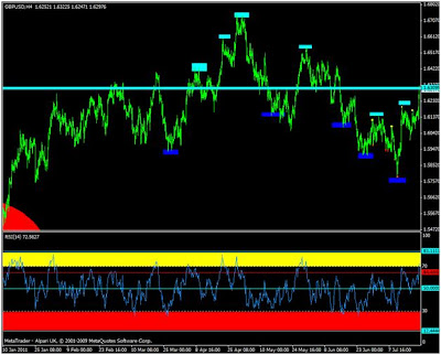
See the daily H4 and M15 charts for daytrading. The sell signal zone on the charts are shown aqua boxes and the buy zones by blue boxes on the M15 chart.
short term Trading:
For the short term trading take the following steps:
a) Use the Daily time frame to pick your trading opportunities
b) Your buy signal is given when the RSI on Daily timeframe enters the Red box and the sell signal when it enters the Yellow box
c) To enter a trade, go to H4 time frame and buy when both RSI on Daily and H4 enter the Red box and the sell signal when Daily and H4 enter the Yellow box
d) RSI 50 point level is where to take your profit or lock your trade (100 pips and above per trade is ideal for this strategy.
See the Daily and H4 charts for short-term trading. The sell signal zone on the charts are shown by the aqua boxes and the buy zones by blue boxes on H4 chart.
Medium term Trading:
For Medium-Term take the following steps:
a) Use the Weekly time frame to pick your trading opportunities
b) Your buy signal is given when the RSI on weekly timeframe enters the Red zone and the sell signal when it enters the Yellow zone
c) To enter a trade, go daily time frame and buy when both RSI on Weekly and daily timeframe enter the Red box and the sell signal when Daily and weekly enter the Yellow box.
d) RSI 50 point level is where to take your profit or lock your trade (500 pips and above per trade (1500 pips most times).
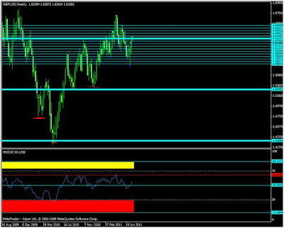
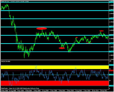
See the Weekly and Daily for medium-term trading. The sell/buy zones on the charts are shown by the red circles on the daily chart
Long term Trading:
For Long-Term take the following steps:
a) Use the monthly time frame to pick your trading opportunities
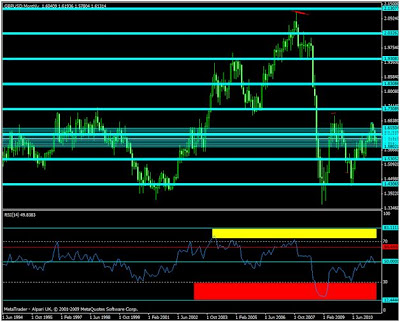
b) Your buy signal is given when the RSI on monthly timeframe enters the Red box and the sell signal when it enters the Yellow box
c) To enter a trade, go to the monthly time frame and buy when both RSI on monthly and weekly timeframe enter the Red box and the sell signal when monthly and weekly RSI enter the Yellow zone. Historical analysis over the years have shown that you can begin to short if there is a reversal candle on the weekly when RSI touches 64-65 on the monthly. You can go down to the daily chart to get the best entry opportunities.
d) RSI 50 point level is where to take your profit or lock your trade (1000-3000 pips).
See the Weekly and monthly and weekly charts for long-term trading. The sell/buy zones are shown by the red boxes on the weekly charts. As you can see such opportunities rare. Personally I have not started trading at that level.
See the Weekly and monthly and weekly charts for long-term trading. The sell/buy zones are shown by the red circles on the weekly charts. As you can see such opportunities very rare. Personally I have not started trading at that level.
How to use mastercharts
I will use the GBPUSD to explain the usage of the charts. You will have observed that GBPUSD is my favourable pair followed by GBPJPY. GBPUSD is more rational, predictable and logical while GBPJPY on the hand is perhaps one of the most irrational and volatile currency pair in the world. If you read some of my previous posts you will have a better insight into the character of some of these pairs.
How to use the Mastercharts
Trading requires careful preparation and insightful analysis. This could be overwhelming and confusing to majority of traders. The truth of the matter is that most traders are incapable of undertaking the complex technical analysis required for informed decisions. The fundamental analysis is a different challenge entirely. I read somewhere that you need 100,000 hours of study to fully understand forex trading. Let me tell you the truth, this statement though slightly exaggerated might not be very far from the truth. However, as a result of my researches over the last few years, I have narrowed down this complex endeavour into some simple easy to understand strategy. The secrets of forex price action are in the higher timeframes. The first step in this process is to prepare the chart for any currency pair you wish to trade to be trader-friendly. How do you make your charts trader-friendly?
How to create a user-friendly chart
If you read my post on how trading could be colourful you will have a clear insight on how to achieve this. As a recap, here are the steps to make your charts user-friendly:
a) Open a new chart for the currency you wish to trade (GBPUSD in this example)
b) Go to the weekly timeframe and draw horizontal lines at the level indicated in my mastercharts. The major levels for GBPUSD are:
a. 1.73000
b. 1.63000
c. 1.53000
d. 1.43000
e. 1.33000
f. 1.23000
c) Insert Relative Strength index (RSI) for 14 days period.
d) Go to the daily timeframe and identify the historical high and low points on the RSI
e) Draw horizontal lines on the daily RSI depicting the historical high and low points.
f) Go to the weekly time frame and click on insert shapes and draw rectangular shape between the highest horizontal line on the RSI and 70 point level. Do the same thing for the lowest point and the 30 point level.
g) Select the rectangular shape above 70 point level and change the colour to yellow. You can select by double clicking on the shape first, then right click and pick rectangular properties and pick the colour from style.
h) Select the rectangular shapes below 30 point level and change the colour to red.
If you follow the above steps, your chart will look like the chart for my example. Your chart is now trader-friendly and you are ready to roll.
Subscribe to:
Posts (Atom)